Themes
React Suite officially provides the following 3 themes by default, you only need a simple configuration to use.
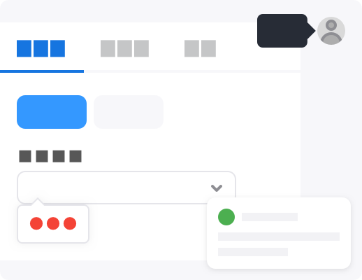
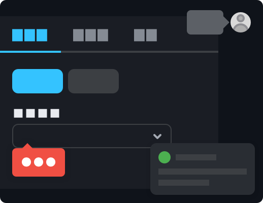
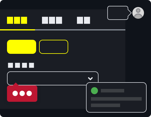
light: Light theme (default).dark: Dark theme. It is usually called the night mode 🌘, to darken the tone in a low-light environment to relieve visual fatigue.high-contrast: High contrast theme. It uses a limited color palette with contrasting colors to make an interface easier to use. It's useful when users have photosensitivity or contrast issues, as well as in low-light environments.
Usage
1. Import style files
@import '~rsuite/dist/rsuite.css';2.CustomProvider
If your application has been included in the <CustomProvider> container, then you only need to add another theme attribute and configure your corresponding theme name.
function App(props) {
  return <CustomProvider theme="dark">{props.children}</CustomProvider>;
}
<CustomProvider> will add a global className to the <body> element during the component rendering process, so that the child elements will act on the corresponding theme style.
If you want to change the theme of only a part of the component, just add the .rs-theme-dark class or the .rs-theme-high-contrast class to any container element to use the corresponding theme style .